Home>Events & Info>Podcast>How To Create Podcast Cover Art


Podcast
How To Create Podcast Cover Art
Published: December 13, 2023
Learn how to create stunning podcast cover art that will grab attention and attract listeners. Get expert tips and tricks for designing eye-catching visuals for your podcast.
(Many of the links in this article redirect to a specific reviewed product. Your purchase of these products through affiliate links helps to generate commission for AudioLover.com, at no extra cost. Learn more)
Table of Contents
- Introduction
- Importance of Podcast Cover Art
- Elements of an Effective Podcast Cover Art
- Step-by-Step Guide to Creating Podcast Cover Art
- Choosing the Right Dimensions and File Format
- Selecting the Ideal Color Scheme
- Typography and Fonts for Podcast Cover Art
- Incorporating Images or Graphics
- Adding Branding Elements
- Designing a Catchy Title or Logo
- Optimizing Your Podcast Cover Art for Different Platforms
- Tools and Resources for Creating Podcast Cover Art
- Conclusion
Introduction
Podcasts have become an increasingly popular medium for sharing content and connecting with audiences, and having a visually appealing and well-designed podcast cover art is essential for attracting listeners. Just like a book cover catches the reader’s eye or a movie poster entices viewers, podcast cover art serves as the first impression of your show.
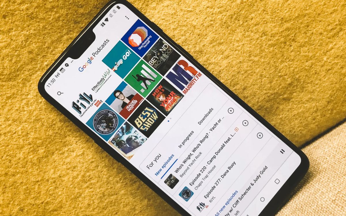
When someone is browsing through a podcast platform or scrolling through their feed, your cover art is the visual representation of your show. It needs to capture their attention, convey the essence of your podcast, and make them want to listen.
Creating effective podcast cover art requires careful attention to detail, a solid understanding of your target audience, and a touch of creativity. It’s not just about slapping a random image and some text together; it’s about crafting a visually compelling and memorable design that reflects the content and style of your podcast.
Not only does high-quality cover art enhance the professionalism of your podcast, but it also increases its discoverability. Many podcast directories and platforms rely on these visuals when recommending and featuring shows to potential listeners. Furthermore, social media platforms like Instagram and Twitter use these images when sharing podcast episodes, so having a captivating cover art can help generate buzz and attract new listeners.
In this article, we will delve into the importance of podcast cover art and explore the crucial elements that make it effective. We will also provide you with a step-by-step guide on how to create compelling podcast cover art, as well as tips on optimizing it for different platforms. Whether you’re a seasoned podcaster looking to revamp your image or an aspiring podcaster starting from scratch, this guide will help you create standout cover art that represents your podcast and attracts a dedicated audience.
Importance of Podcast Cover Art
Podcast cover art goes beyond just being a visually appealing image. It serves as a crucial tool for attracting listeners and making a lasting impression. Here are a few reasons why podcast cover art is so important:
- First Impression: Your podcast cover art is the first thing potential listeners see when browsing through a podcast platform. It acts as a window into your podcast, giving them an idea of what to expect. A captivating cover art can entice them to click on your podcast and explore further.
- Brand Identity: Your cover art is a reflection of your podcast’s brand. It should convey the overall tone, style, and genre of your show. By creating a consistent visual identity, you can build recognition and loyalty among your audience.
- Discoverability: When users search for podcasts on platforms like Apple Podcasts or Spotify, the search results are often displayed in a grid or list view. Eye-catching cover art can make your podcast stand out from the competition, increasing the chances of attracting new listeners.
- Shareability: Good cover art is easily recognizable, even in small sizes or when shared on social media. When listeners enjoy your podcast, they may share it with their friends or post about it on their social accounts. Having visually appealing cover art makes it more likely that people will recognize and engage with your content when shared.
- Professionalism: Well-designed cover art gives your podcast a professional and polished look. It conveys that you take your podcasting seriously and are committed to delivering high-quality content. This can help build trust and credibility with your audience.
Remember, your podcast cover art is an opportunity to visually communicate what your show is all about. It should capture the essence of your content and resonate with your target audience. By investing time and effort into creating compelling cover art, you can significantly enhance your podcast’s visibility and attract a dedicated listener base.
Elements of an Effective Podcast Cover Art
Creating an effective podcast cover art requires careful consideration of various elements. These elements work together to create a visually appealing design that captures the essence of your podcast. Here are some key elements to keep in mind:
- Clarity: Your cover art should clearly convey the purpose and theme of your podcast. Avoid clutter and keep the design clean and focused. Use imagery, typography, and colors that align with your podcast’s content and style.
- Eye-Catching Imagery: Choose an image or graphic that grabs attention and accurately represents your podcast. It could be a relevant icon, an illustration, a photo, or a combination of elements. Make sure the image is high-quality and visually compelling.
- Typography: The font selection and arrangement of text play a crucial role in conveying the mood and tone of your podcast. Choose fonts that are easy to read and align with your show’s personality. Experiment with different font styles, sizes, and colors to create a visually appealing combination.
- Color Scheme: Colors evoke emotions and contribute to the overall vibe of your cover art. Consider your podcast’s genre, target audience, and theme when selecting a color scheme. Use colors that complement each other, and ensure that the text is legible against the background.
- Branding Elements: Incorporate your podcast’s branding elements, such as logos, icons, or taglines, into your cover art. Consistency in branding helps viewers recognize your podcast amidst other shows and creates a cohesive visual identity.
- Title or Podcast Name: Design a visually appealing title or logo for your podcast. The typography, placement, and styling of the title are key. It should be legible, attention-grabbing, and reflective of your podcast’s style.
- Simplicity: Keep your design simple and avoid overcrowding the cover art. Minimalism often has a powerful impact. Distilling your podcast’s essence into a clean, simple design helps it stand out and makes it more memorable.
Keep in mind that these elements work in harmony to create a cohesive and visually appealing cover art. Experiment with different combinations and designs to find the one that best represents your podcast’s unique identity. Remember, the goal is to capture the attention of potential listeners and make a lasting impression.
Step-by-Step Guide to Creating Podcast Cover Art
Creating compelling podcast cover art is an exciting process that allows you to showcase your podcast’s identity and attract potential listeners. Follow these steps to create an eye-catching cover art for your podcast:
- Define Your Podcast’s Identity: Start by clarifying the purpose, theme, and target audience of your podcast. This will help guide your design decisions and ensure that your cover art accurately reflects your podcast’s content.
- Gather Inspiration: Look for inspiration from other podcasts, graphic design websites, or even artwork unrelated to podcasts. Create a mood board or gather images and design elements that resonate with the vibe and style you envision.
- Choose the Right Dimensions and File Format: Different podcast platforms have specific requirements for cover art dimensions. For example, Apple Podcasts requires a minimum size of 1400 x 1400 pixels and a maximum size of 3000 x 3000 pixels. Use an image editing tool like Adobe Photoshop or Canva to set the correct dimensions for your cover art. Save your final design as a high-quality JPEG or PNG file.
- Select the Ideal Color Scheme: Decide on a color scheme that reflects the mood and tone of your podcast. Use colors that are visually appealing and align with your brand. Experiment with different combinations and consider using color psychology to evoke specific emotions.
- Typography and Fonts: Choose fonts that are easy to read and align with your podcast’s style. Consider using a combination of fonts for the title and subtitles to create visual contrast. Ensure that the text is legible against the background and select font sizes that are appropriate for different sizes of your cover art.
- Incorporate Images or Graphics: Select images or graphics that are relevant to your podcast’s theme. These visuals should catch the viewer’s attention and convey the essence of your show. Make sure the images are high-quality and represent your podcast accurately.
- Add Branding Elements: Include your podcast’s branding elements, such as logos or icons, in your cover art. These branding elements help viewers recognize your podcast and create a cohesive visual identity.
- Design a Catchy Title or Logo: Create a visually appealing title or logo for your podcast. Experiment with typography, styling, and placement to make it stand out. Ensure that the title is legible and reflective of your podcast’s style.
- Optimize Your Podcast Cover Art for Different Platforms: Adjust your cover art design to fit the requirements of various podcast platforms. Some platforms may crop the image or display it in a circular format. Make sure your design works well in different formats without compromising its visual appeal.
- Seek Feedback and Iterate: Once your cover art design is complete, seek feedback from friends, fellow podcasters, or your target audience. Iterate and make adjustments based on the feedback to refine your design further.
Remember, creating podcast cover art is an iterative process. Don’t be afraid to experiment, gather feedback, and make changes until you are satisfied with the final result. A well-designed cover art will not only attract listeners but also set the tone for your podcast’s brand and identity.
Choosing the Right Dimensions and File Format
When it comes to podcast cover art, selecting the correct dimensions and file format is crucial. Different podcast platforms have specific requirements, and adhering to these guidelines ensures that your cover art displays correctly and looks professional. Here’s a guide to help you choose the right dimensions and file format:
Dimensions: Podcast cover art dimensions can vary across platforms, but it’s important to aim for a high-resolution image to maintain clarity and quality. The recommended size by Apple Podcasts is a minimum of 1400 x 1400 pixels and a maximum of 3000 x 3000 pixels. However, some platforms accept sizes up to 5000 x 5000 pixels. It’s essential to check the specifications of the podcast platform you’re targeting to ensure your cover art meets their requirements.
File Format: The two most common file formats for podcast cover art are JPEG and PNG.
- JPEG: JPEG is a compressed file format that provides high-quality images with relatively smaller file sizes. It is widely supported and is suitable for most podcast platforms. However, keep in mind that JPEG files may experience some loss of image quality due to compression.
- PNG: PNG is a lossless file format that maintains the highest image quality even after compression. It supports transparency, making it ideal for designs that incorporate layered elements or require background transparency. PNG files are larger in size compared to JPEG, which can affect download times and storage capacity.
When saving your podcast cover art, opt for the highest-quality option available in your image editing software. This ensures that the details and colors of your design are preserved.
It’s important to note that podcast platforms may have specific file size limitations. For example, Apple Podcasts requires your file to be under 500 KB, while Spotify recommends a limit of 512 KB. Before finalizing your cover art, check the guidelines provided by the platform you’re targeting to ensure your file meets their requirements.
Remember, the dimensions and file format of your podcast cover art play a significant role in how your artwork displays across various platforms. By choosing the right dimensions and saving your file in the appropriate format, you can ensure that your cover art looks professional, visually appealing, and meets the specifications of the platforms where you’ll be showcasing your podcast.
Selecting the Ideal Color Scheme
Selecting the right color scheme for your podcast cover art is crucial as it sets the tone, captures attention, and conveys the mood of your show. A well-chosen color scheme can make your cover art visually appealing and memorable. Here are some tips to help you select the ideal color scheme:
Understand Your Podcast: Start by considering the genre, theme, and target audience of your podcast. Think about the emotions and feelings you want to evoke. Is your podcast serious and informative, or is it lighthearted and humorous? Understanding the essence of your podcast will guide your color choices.
Color Psychology: Colors have the power to evoke specific emotions and associations. Consider the psychological impact of different colors and their relevance to your podcast’s content. For example:
- Red: Often associated with passion, energy, and excitement. It can be used for attention-grabbing cover art.
- Blue: Represents calmness, trust, and reliability. It works well for informative or business-related podcasts.
- Yellow: Symbolizes positivity, happiness, and warmth. Yellow can be used for podcasts that focus on joy, inspiration, or creativity.
- Green: Associated with nature, growth, and health. It can be suitable for environmental or wellness-related podcasts.
- Purple: Often associated with mystery, creativity, and spirituality. It can be used for podcasts that delve into the supernatural or artistic realms.
Color Harmony: Create a harmonious color scheme by selecting colors that complement each other. You can use online tools like Adobe Color or Coolors to generate color palettes based on a chosen color or a combination of colors. These tools can provide you with various options to explore.
Contrast: Ensure that there is enough contrast between your background color and text or graphic elements to maintain readability. A high contrast will make your cover art stand out and prevent any visual confusion.
Simplicity: While it is tempting to use multiple colors, keeping your color scheme simple is often more effective. Limit yourself to two or three main colors to avoid overwhelming your cover art.
Consider Branding: If you have an existing brand or logo associated with your podcast, consider incorporating its colors into your cover art. This helps establish consistency and reinforces your branding across platforms.
Remember, the color scheme you choose should align with the tone, theme, and target audience of your podcast. Take the time to explore different combinations, consider the psychological impact of colors, and create a visually appealing cover art that invites potential listeners to discover your podcast.
Typography and Fonts for Podcast Cover Art
The typography and fonts you select for your podcast cover art play a crucial role in conveying your podcast’s personality and attracting potential listeners. Here are some tips to help you choose the right typography and fonts:
Legibility: The most important consideration when selecting fonts for your cover art is legibility. Ensure that your chosen fonts are clear, easy to read, and not overly decorative. Avoid using cursive or script fonts that may be difficult to decipher, especially at smaller sizes.
Mood and Personality: Fonts have a unique personality and can evoke specific moods. Consider the tone and style of your podcast and choose fonts that align with its personality. For example, a bold, uppercase font might convey strength and authority, while a handwritten font might evoke a more personal and intimate feel.
Font Combination: Experiment with font combinations to create visual interest and contrast. Pair a bold, eye-catching font with a more understated font for the title and supporting text. Ensure that the combination is harmonious and does notcause visual clutter.
Consistency: Using consistent fonts in your cover art and other branding materials helps establish a cohesive visual identity. If you already have a logo or established branding, consider selecting fonts that complement those elements.
Hierarchy: Consider the hierarchy of your text and use font variations to emphasize important elements. For example, use a larger and bolder font for the podcast title while using a smaller and lighter font for additional text or episode details.
Alignment and Placement: Pay attention to the alignment and placement of your text to create a balanced and visually pleasing composition. Experiment with different placements and orientations to find the most effective arrangement for your cover art.
Font Size: Ensure that your text is legible at different sizes and resolutions. What may look good on a computer screen may appear too small on a mobile device. Test your cover art on various devices or platforms to ensure readability at different sizes.
Limit Font Varieties: Avoid using too many different fonts as it can result in a cluttered and unprofessional look. Limit yourself to two or three fonts that complement each other and maintain consistency throughout your cover art.
Contrast: Use contrast between your text and the background to make the text stand out. Ensure that the text is easily readable and that there is enough contrast to avoid any eye strain.
Remember, the typography and fonts you choose should not only be visually appealing but also convey the personality and style of your podcast. Experiment with different font combinations, sizes, and placements until you find the perfect typography that enhances the overall impact of your podcast cover art.
Incorporating Images or Graphics
Including images or graphics in your podcast cover art can make it visually appealing, capture attention, and convey the essence of your podcast. Here are some tips for effectively incorporating images or graphics:
Relevance: Choose images or graphics that are directly related to the theme or content of your podcast. The visuals should provide visual cues about the topics or style of your show, giving potential listeners a glimpse of what to expect.
High-Quality Images: Ensure that the images or graphics you use are of high quality. Blurry or pixelated images can detract from the overall professionalism of your cover art. If you’re using stock photos, opt for high-resolution images from reputable sources.
Icons or Illustrations: Consider using icons or illustrations to represent your podcast’s concept or genre. Icons can be simple and easy to recognize, while illustrations can add a unique and artistic touch to your cover art.
Composition: Pay attention to the composition of the images or graphics within your cover art. Consider the placement, size, and relationship between the visuals and other design elements, such as text or branding elements. Strive for a balanced and visually pleasing composition.
Layering and Overlapping: Experiment with layering or overlapping images and graphics to create depth and visual interest. This technique can add dimension to your cover art and make it stand out from others.
Consider Negative Space: Negative space refers to the empty or blank areas in your cover art. Utilize negative space strategically to draw attention to the main focal points of your design, such as the title or key visual elements.
Branding Integration: Incorporate your podcast’s branding elements, such as logos, icons, or even color schemes, within the images or graphics. This helps create a cohesive visual identity and reinforces your podcast’s brand.
Simplicity: Avoid overcrowding your cover art with too many images or graphics. Keep the design clean and focused, ensuring that the visuals complement the overall composition without overwhelming it.
Consistency: If you’re using images or graphics in each episode’s cover art, aim for consistency in style or theme. This helps create recognition and a sense of unity across your podcast’s episodes.
Remember, the images or graphics you incorporate should enhance your podcast cover art and communicate its message effectively. Strive for a visually appealing design that captures attention and entices potential listeners to explore your podcast further.
Adding Branding Elements
Adding branding elements to your podcast cover art helps create visual recognition and establishes a cohesive identity. These elements make your cover art distinct and instantly recognizable. Here are some tips for effectively incorporating branding elements:
Logo Integration: Incorporate your podcast’s logo into your cover art. Place it strategically, such as in a corner or at the bottom, to ensure it does not overpower the overall design. Make sure it is clear and legible, even at smaller sizes.
Color Consistency: Use the color scheme associated with your podcast’s branding in your cover art. Consistency in color helps create a sense of familiarity and reinforces your brand’s identity. Ensure that the colors complement each other and match the overall tone of your podcast.
Font Selection: Use fonts consistent with your podcast’s branding. If you have a specific font associated with your brand, incorporate it into your cover art. Consistency in typography helps establish a cohesive visual identity and reinforces your podcast’s professionalism.
Tagline or Slogan: If your podcast has a memorable tagline or slogan, consider incorporating it into your cover art. Place it strategically alongside other elements, such as the title or logo, to reinforce your podcast’s message and value proposition.
Iconography: If your brand includes specific icons or symbols, utilize them within your cover art. These icons can act as visual cues that represent your podcast’s niche or genre. Incorporate them in a way that enhances the overall design and adds to the recognition of your brand.
Consistency Across Platforms: Ensure that your branding elements are consistent across different platforms where your podcast is featured. Whether it’s on podcast directories, social media, or your website, maintaining a consistent brand identity helps build recognition and trust among your audience.
Branded Background: Consider using a branded background or pattern that complements your logo and color scheme. This can add visual interest to your cover art and make it more memorable. Ensure that the background does not distract from the main elements of your design.
Test for Readability: While it’s important to incorporate branding elements, make sure they do not hinder the readability of your cover art. The text and visuals should be clear and easy to read, even at smaller sizes or when viewed on different devices.
Remember, incorporating branding elements into your podcast cover art helps establish a visual identity and creates recognition among your target audience. Strive for consistency and find a balance between incorporating branding elements and maintaining the overall professionalism and visual appeal of your design.
Designing a Catchy Title or Logo
Designing a catchy title or logo is crucial for creating memorable podcast cover art. Your title or logo serves as the centerpiece of your cover art, attracting attention and conveying the essence of your podcast. Here are some tips for designing a catchy title or logo:
Simplicity: Keep your title or logo design simple and impactful. Avoid cluttering it with too many elements or intricate details. A clean and straightforward design allows for better readability and recognition.
Typography: Choose a font or typography style that reflects the tone and personality of your podcast. Experiment with different fonts and styles to find the one that captures the essence of your show. Bold and unique fonts can make your title or logo stand out, while elegant and classic fonts can convey a more refined image.
Visual Elements: Incorporate relevant visual elements that enhance the meaning and theme of your podcast. These can include icons, illustrations, or graphics that represent your niche or topic. Make sure these elements are clear, visually appealing, and complement the overall design.
Color Palette: Select colors that align with your podcast’s branding and evoke the desired emotions. Colors have psychological associations and can evoke specific moods. Consider the message you want to convey and choose colors that reinforce that message. Ensure that the colors used for your title or logo are consistent with the overall color scheme of your cover art.
Iconography: Creating a small, recognizable icon to accompany your title can make it more visually appealing and memorable. This icon can be a simplified representation of your podcast’s theme or a visual symbol associated with your brand. Ensure that the icon is relevant, visually distinctive, and works well in different sizes.
Layout and Composition: Experiment with different layouts and compositions to find the most visually pleasing arrangement for your title or logo. Consider the placement and size of your title or logo in relation to other design elements within your cover art. Ensure that it maintains a balance and doesn’t overpower or get lost amidst other elements.
Consistency: Ensure that your title or logo aligns with your podcast’s branding and visual identity. Consistency across your cover art, website, social media, and other promotional materials reinforces your podcast’s professionalism and helps with brand recognition.
Test for Legibility: After designing your title or logo, test it in various sizes and resolutions to ensure legibility. It should be clear and easily readable, even at smaller sizes or when viewed on different devices or platforms.
Remember, your title or logo is the visual representation of your podcast. It’s the first thing that potential listeners will see, so make it catchy, visually appealing, and reflective of your podcast’s style and content. A well-designed title or logo will help your cover art stand out and make a lasting impression on your audience.
Optimizing Your Podcast Cover Art for Different Platforms
Optimizing your podcast cover art for different platforms is essential to ensure it displays correctly and attracts potential listeners. Each platform may have specific requirements and guidelines for cover art. Here are some tips for optimizing your podcast cover art:
Size and Dimensions: Familiarize yourself with the size and dimension recommendations for each platform. For example, Apple Podcasts recommends a minimum of 1400 x 1400 pixels and a maximum of 3000 x 3000 pixels. Spotify recommends a square cover art size of 3000 x 3000 pixels. Ensure that your cover art meets these requirements to avoid any display issues.
File Format: Save your cover art in the appropriate file format recommended by the platform. Most platforms accept JPEG or PNG files. However, it’s always good to double-check the guidelines to ensure the best compatibility and quality.
Thumbnail Compatibility: Some platforms, such as YouTube or social media platforms, may display your podcast cover art as a thumbnail. Ensure that your cover art maintains its visual appeal and legibility even when displayed as a smaller thumbnail. Test it at different sizes to ensure clarity and readability.
Crop Considerations: Be mindful of how your cover art may be cropped on different platforms. Some may display cover art in a circular format, while others may crop it to fit within a square shape. Keep important design elements, such as text or visuals, within the safe areas of the cover art to prevent them from being cut off or hidden.
Font Size and Legibility: Check that your cover art’s text is legible and easily readable, even at smaller sizes. Avoid using fonts that are too thin or intricate, as they may become difficult to read on certain platforms or devices.
Consistent Branding: Maintain a consistent branding identity across different platforms. This includes using the same logo, color scheme, and fonts. A consistent branding presence helps establish recognition and builds trust with your audience.
Localization: If you plan to target audiences in different languages or regions, consider localizing your cover art accordingly. This may involve translating text or adapting visuals to resonate with specific cultural preferences or symbolism.
Test and Preview: Test your cover art on different platforms and devices to ensure its appearance and functionality. Preview it on mobile devices, laptops, and various podcast apps to ensure that the overall design, colors, and text are visually appealing and legible.
Update and Refresh: Occasionally review and update your cover art to keep it fresh and relevant. As your podcast evolves, your cover art should reflect any changes in content, branding, or messaging. This can help attract new listeners and maintain interest among existing subscribers.
Remember, optimizing your podcast cover art for different platforms ensures that your design is showcased at its best and reaches potential listeners effectively. By following platform-specific guidelines and considering how your cover art will display in various contexts, you can create a visually appealing and professional representation of your podcast.
Tools and Resources for Creating Podcast Cover Art
Creating podcast cover art can be made easier and more efficient with the help of various tools and resources. These tools provide features and templates that can streamline the design process and enable you to create professional-looking cover art. Here are some popular tools and resources you can use:
Adobe Photoshop: Adobe Photoshop is a powerful image editing software widely used by professionals. It offers advanced features and customization options for designing cover art. With Photoshop, you can create custom graphics, manipulate images, and fine-tune every aspect of your cover art.
Canva: Canva is a user-friendly online design tool that offers a range of templates, graphics, and fonts specifically tailored for creating cover art. It provides drag-and-drop functionality, making it easy to customize elements and create professional-looking designs, even if you have little design experience.
Adobe Spark: Adobe Spark is a creative platform that offers design tools for creating social media posts, videos, and graphics. It includes templates and customization options specifically designed for podcast cover art. It’s user-friendly and requires no design experience to create stunning cover art.
Pixlr: Pixlr is a free online image editing tool that offers a variety of features for creating or enhancing your podcast cover art. It provides essential tools for cropping, resizing, and adjusting images, as well as adding text and overlays to your designs.
Freepik: Freepik is a popular resource for free vector graphics, illustrations, and icons. It offers a vast library of resources that can be used to enhance your cover art. You can find elements that match your podcast’s theme and style, and customize them to fit your design.
Unsplash: Unsplash is a renowned website offering a wide collection of high-quality, royalty-free images. You can browse through their extensive library to find visually stunning images that match your podcast’s theme and incorporate them into your cover art.
Google Fonts: Google Fonts provides a vast collection of fonts that you can use in your cover art. You can browse through various font styles, preview them, and integrate them into your design. Google Fonts is free to use and ensures cross-platform compatibility.
Stock Photo Websites: If you’re looking for professional stock photos to use as a background or central visual element, websites like Shutterstock, Getty Images, or Pexels offer a wide range of high-quality images that you can license for use in your cover art.
Remember, these tools and resources can aid you in creating visually appealing podcast cover art. Whether you’re a design novice or experienced artist, these tools simplify the process and help you create captivating and professional designs that effectively represent your podcast.
Conclusion
Creating compelling and visually appealing podcast cover art is essential for attracting listeners and making a lasting impression. Your cover art serves as the first point of contact for potential listeners, representing the essence and style of your podcast. By following the steps outlined in this guide, you can create standout cover art that captures attention and entices listeners to explore your show further.
We discussed the importance of podcast cover art as a tool for attracting listeners and establishing your podcast’s brand identity. We explored the elements that make up effective cover art, including clarity, eye-catching imagery, typography, color scheme, and branding. We provided a step-by-step guide to help you create your own cover art, from defining your podcast’s identity to optimizing it for different platforms.
We also highlighted the various tools and resources available for creating podcast cover art, such as Adobe Photoshop, Canva, Pixlr, and platforms like Freepik and Unsplash. These resources can assist you in designing professional-looking cover art, even if you have limited design experience or access to graphic design software.
Remember, creating podcast cover art is not just about aesthetics; it is about effectively communicating your podcast’s message and enticing potential listeners to click and explore. Your cover art should reflect your podcast’s unique identity and capture the attention of your target audience.
By investing time and effort into creating visually compelling cover art, optimizing it for various platforms, and utilizing the tools and resources available, you can create podcast cover art that stands out and represents your show in the best possible light.
So, take this knowledge and bring your podcast cover art to life. Craft an engaging design that captures the essence of your podcast and captivates potential listeners. With a visually appealing and well-designed cover art, you can increase the discoverability of your podcast and make a strong first impression in the ever-expanding podcasting landscape.

