Home>Production & Technology>Audiophile>Beginner Explain Audio Frequency Graphs And What To Look For Audiophile
Audiophile
Beginner Explain Audio Frequency Graphs And What To Look For Audiophile
Modified: January 22, 2024
Learn how to read audio frequency graphs and discover what audiophiles should look for when evaluating sound quality. Enhance your listening experience as an audiophile.
(Many of the links in this article redirect to a specific reviewed product. Your purchase of these products through affiliate links helps to generate commission for AudioLover.com, at no extra cost. Learn more)
Table of Contents
Introduction
Welcome to the world of audiophiles, where the pursuit of the perfect sound is an art form in itself. Audiophiles are passionate about high-quality audio reproduction, and they invest in top-notch audio equipment to enjoy music, movies, and other forms of media in the best possible way. One crucial aspect of audio quality is understanding and analyzing audio frequency graphs.
Audio frequency graphs provide valuable insights into how different frequencies are reproduced by audio systems. They help us understand the strengths and weaknesses of audio equipment, and can guide us in making informed decisions when selecting or fine-tuning our audio setups. Whether you are a seasoned audiophile or just starting your audio journey, understanding audio frequency graphs is essential for achieving the best audio experience.
In this article, we will dive into the world of audio frequency graphs, exploring the different types, the key components they depict, and what to look for as an audiophile.
So, get ready to unravel the mysteries of audio frequency graphs and embark on a journey to elevate your audio enjoyment to new heights!
Understanding Audio Frequency Graphs
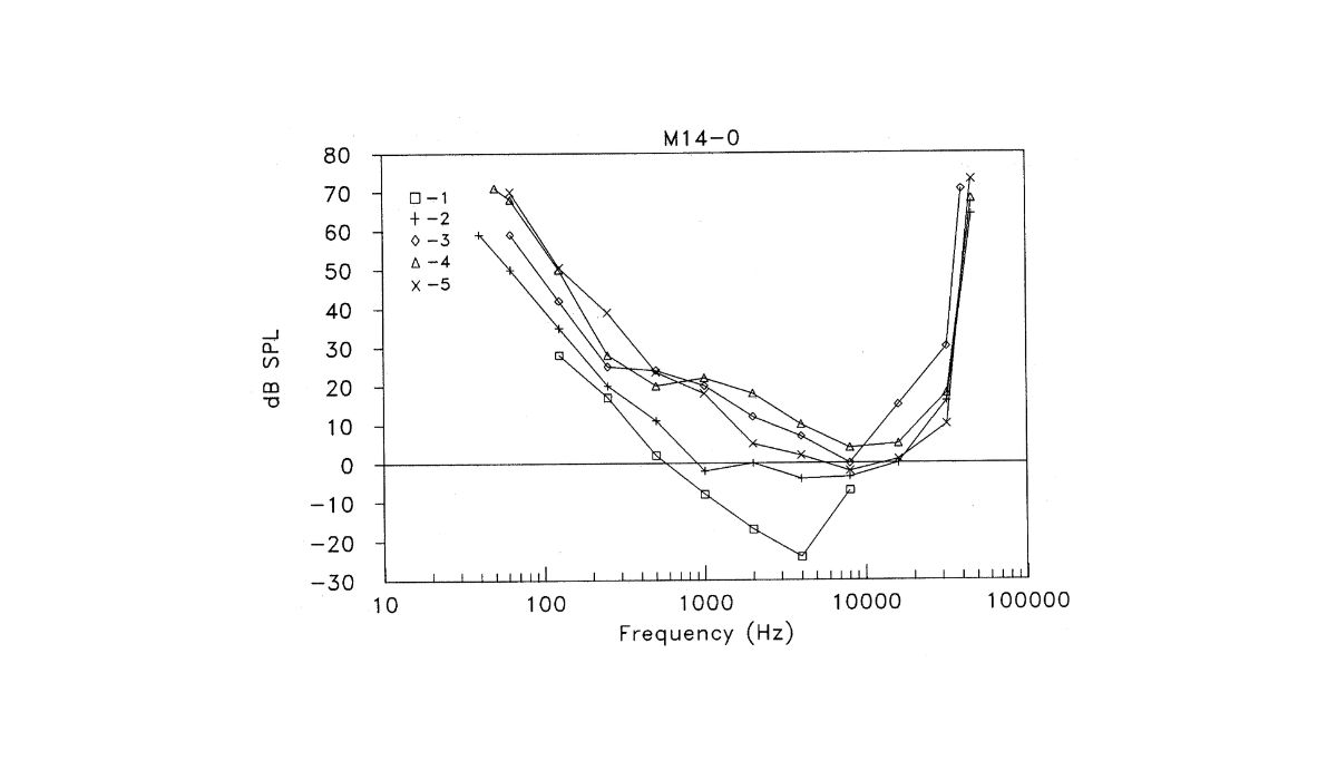
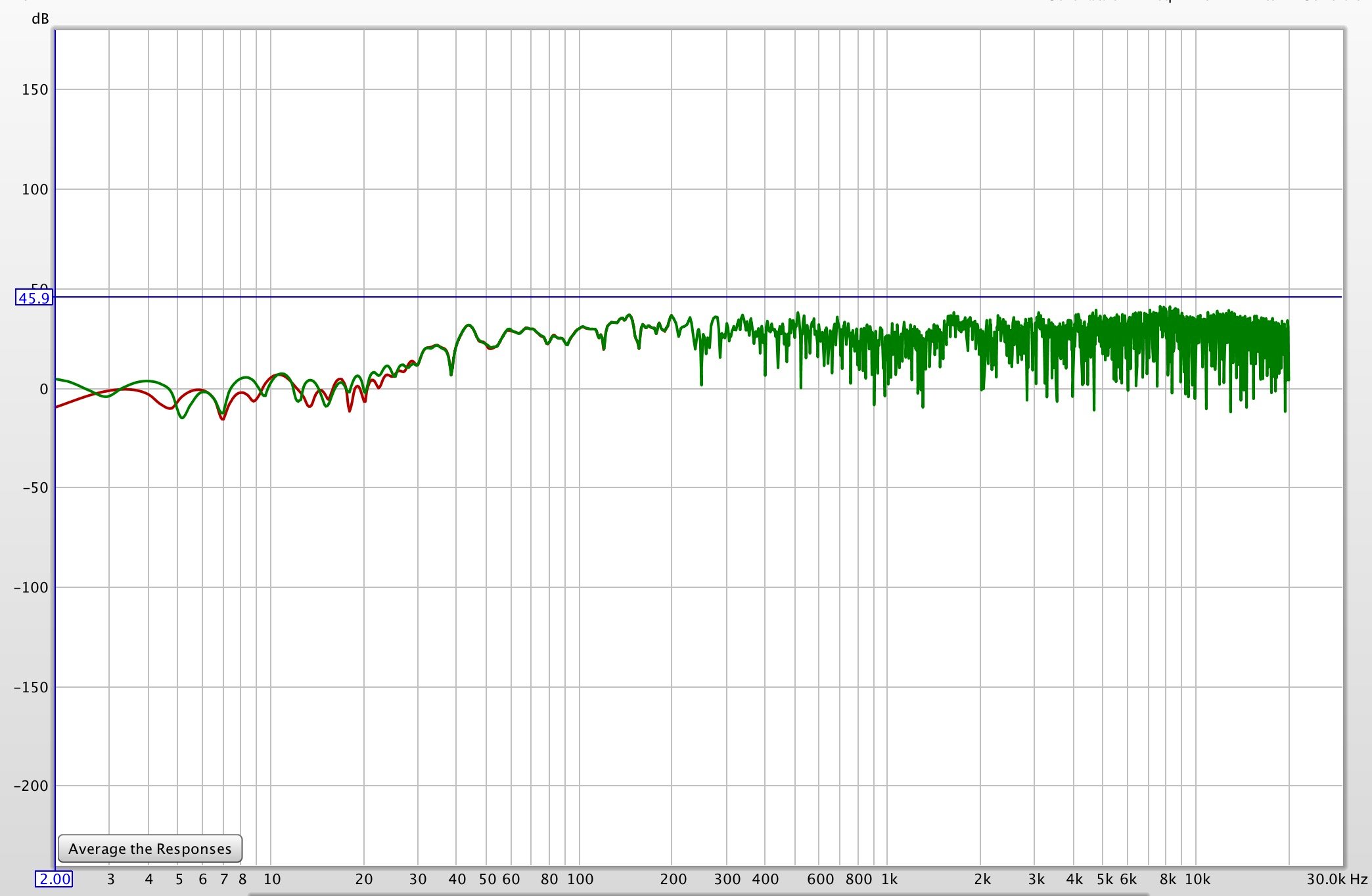
Audio frequency graphs, also known as frequency response graphs, provide a visual representation of how audio systems reproduce different frequencies across the audible spectrum. They illustrate the relative level of frequencies, allowing us to analyze the tonal balance and performance of audio equipment.
Frequency graphs typically have frequency on the x-axis and level on the y-axis, with a range from low frequencies (bass) to high frequencies (treble). The graph shows the response of the audio system at various frequencies, indicating whether certain frequencies are emphasized or attenuated, or if there are any irregularities or dips in the frequency response.
By interpreting these graphs, audiophiles can identify the overall tonal character of an audio device. For example, a graph with elevated bass frequencies might suggest a warmer, bass-heavy sound, while a graph with a flat response across the frequency range indicates a more neutral, accurate reproduction of sound.
It’s important to note that audio frequency graphs are not limited to just one set of measurements. Different manufacturers or sources may use different measurement techniques or reference points, resulting in variations in the graphs. Additionally, the room acoustics and placement of speakers can also influence the frequency response, so it’s essential to consider these factors alongside the graphs.
Understanding audio frequency graphs is a key skill for audiophiles as it allows them to evaluate the performance of audio equipment, identify any tonal imbalances or deficiencies, and make informed decisions regarding system configuration, speaker placement, and equalization.
Now that we have a basic understanding of audio frequency graphs, let’s take a closer look at the different types of graphs you may encounter as an audiophile.
Types of Audio Frequency Graphs
Audio frequency graphs come in various forms, each providing different insights into the frequency response of audio systems. Here are some of the most common types you may encounter as an audiophile:
- Overall Frequency Response: This type of graph provides a comprehensive overview of the system’s frequency response across the entire audible spectrum. It shows the relative level of each frequency, allowing you to assess the tonal balance of the audio equipment. A flat frequency response is generally desired, as it indicates a neutral and accurate reproduction of sound.
- Impulse Response: Impulse response graphs measure the system’s ability to faithfully reproduce transient sounds. They depict how quickly a system responds to an input signal and how it decays over time. An ideal impulse response graph will show a sharp initial spike followed by a quick decay, indicating a precise and accurate reproduction of sound.
- Waterfall Plot: Waterfall plots provide a three-dimensional representation of frequency response over time. They visually demonstrate how different frequencies decay or resonate in a room, giving insights into room resonances and potential issues with bass reproduction. This type of graph is particularly useful when assessing the acoustic properties of a listening environment.
- Harmonic Distortion: Harmonic distortion graphs reveal the level of distortion introduced by an audio system when reproducing different frequencies. They show the additional harmonics generated by the system, which can degrade the accuracy and fidelity of the original sound. Lower distortion levels are generally preferred, as they indicate a cleaner and more faithful reproduction of audio.
- Phase Response: Phase response graphs depict the phase shifts introduced by an audio system at various frequencies. They measure how accurately the system reproduces the phase relationships between different frequency components of an audio signal. A flat phase response indicates a faithful reproduction, while irregularities in phase response can potentially affect the imaging and spatial characteristics of the sound.
These are just a few examples of the types of audio frequency graphs you may come across. Each graph provides unique insights into specific aspects of audio reproduction, helping audiophiles make informed decisions about their equipment and system setup.
Now that we understand the different types of audio frequency graphs, let’s explore the key components depicted in these graphs and their significance for audiophiles.
Key Components of Audio Frequency Graphs
When analyzing audio frequency graphs, it’s essential to familiarize yourself with the key components depicted in these graphs. Understanding these components will allow you to assess the performance and characteristics of audio equipment more effectively. Here are the key components to look for:
- Frequency Range: The frequency range depicted on the x-axis of the graph shows the span of frequencies being measured. It typically ranges from 20 Hz (low bass) to 20 kHz (high treble), covering the audible spectrum for most individuals.
- Level: The y-axis of the graph represents the level or amplitude of the frequencies being measured. It indicates how loud or soft the audio system reproduces each frequency, with higher values indicating louder volumes.
- Flat Response: A flat frequency response means that all frequencies are reproduced with equal emphasis or loudness. This is often desired as it signifies a neutral and accurate reproduction of the audio signal. A graph with slight deviations from a flat response may still be acceptable, but larger variations can indicate tonal imbalances or inconsistencies in the audio system.
- Peak/Dip Frequencies: Peaks and dips on the graph represent specific frequencies that are emphasized or attenuated by the audio system. Peaks indicate frequencies that are boosted, which can result in a more pronounced or emphasized sound in that frequency range. Dips indicate frequencies that are attenuated or reduced in volume, which can lead to a weaker or less pronounced sound in that range.
- Slope: The slope of the frequency response graph indicates how the level of frequencies changes over the frequency range. A gradual slope or a gentle roll-off towards the high and low frequencies is often desired, as it can result in a more balanced and natural sound reproduction.
By examining these key components in audio frequency graphs, you can gain a deeper understanding of how the audio equipment performs and the unique characteristics it possesses. This knowledge will help you make informed decisions when selecting audio components and fine-tuning your system for optimal audio quality.
Now that we have covered the key components of audio frequency graphs, let’s explore what audiophiles should look for when analyzing these graphs.
What to Look for as an Audiophile
As an audiophile, analyzing audio frequency graphs can provide valuable insights into the performance and quality of audio equipment. Here are some key factors to consider when examining these graphs:
- Flat Frequency Response: Look for a frequency response that is as flat as possible across the audible spectrum. This indicates a neutral sound reproduction, without any emphasis or attenuation of specific frequencies. A flat response ensures that the audio equipment is faithful to the original recording and reproduces sound accurately.
- Smooth and Consistent Slope: Pay attention to the slope of the frequency response graph. A smooth and consistent slope indicates a well-balanced tonal character, where the transition between frequencies is seamless. Avoid graphs with sharp spikes or dips, as they can lead to an uneven sound reproduction and affect the overall listening experience.
- Minimal Peaks and Dips: While some variation in the frequency response is normal, excessive peaks and dips can result in an imbalanced audio presentation. Look for graphs with minimal irregularities, as they suggest a more natural and accurate sound reproduction.
- Low Distortion: Check for low levels of harmonic distortion in the graph. Minimal distortion ensures that the audio equipment faithfully reproduces the original sound without introducing any unwanted artifacts or coloration.
- Phase Coherence: Evaluate the phase response of the audio system. A flat phase response indicates that the audio components are reproducing the timing and phase relationships of the audio signal accurately. This contributes to a more precise soundstage and imaging.
Remember that audio frequency graphs are just one tool in evaluating audio equipment, and they should be considered alongside other factors such as listening tests and personal preferences. It’s important to strike a balance between technical measurements and subjective listening experiences.
Additionally, keep in mind that different genres of music and personal preferences might lead to slight variations in what is considered ideal. Some audiophiles might prefer a warmer sound with boosted bass frequencies, while others might prioritize a more neutral and analytical sound signature.
Ultimately, as an audiophile, trust your ears and use the frequency graphs as a guide to help you find the audio equipment that aligns with your preferences and delivers the sonic experience you desire.
With these insights, you are now equipped to analyze audio frequency graphs and make informed decisions when it comes to selecting and fine-tuning your audio system.
Conclusion
Understanding audio frequency graphs is an essential skill for audiophiles who seek to achieve the highest quality audio experience. These graphs provide a visual representation of the frequency response of audio systems, allowing us to assess tonal balance, identify strengths and weaknesses, and make informed decisions when selecting or fine-tuning audio equipment.
Throughout this article, we have explored the different types of audio frequency graphs, such as overall frequency response, impulse response, waterfall plots, harmonic distortion, and phase response. Each type offers unique insights into specific aspects of audio reproduction, helping us evaluate the performance and characteristics of our audio systems.
Key components of audio frequency graphs, such as flat frequency response, smooth slope, minimal peaks and dips, low distortion, and phase coherence, guide audiophiles in assessing the quality and accuracy of audio reproduction. These factors, along with personal preferences and listening tests, help us make decisions that align with our desired sonic experience.
Remember, audio frequency graphs are just one tool in the audiophile’s toolbox. While they provide valuable information, they should be considered alongside subjective listening experiences and individual musical preferences. Trust your ears, and use the graphs as a guide to enhance your audio journey.
So, next time you encounter an audio frequency graph, dive into its intricacies, examine the tonal balance, take note of any irregularities, and make informed decisions to create a truly immersive and delightful audio experience.