Home>Events & Info>Podcast>How To Create A Podcast Logo


Podcast
How To Create A Podcast Logo
Published: December 13, 2023
Learn how to create a professional podcast logo that reflects your brand. Enhance your podcast's identity with a captivating design and attract more listeners.
(Many of the links in this article redirect to a specific reviewed product. Your purchase of these products through affiliate links helps to generate commission for AudioLover.com, at no extra cost. Learn more)
Table of Contents
- Introduction
- Understanding the importance of a podcast logo
- Step 1: Define your podcast’s brand identity
- Step 2: Research and gather inspiration
- Step 3: Decide on the logo style
- Step 4: Choose appropriate colors and fonts
- Step 5: Sketch your ideas
- Step 6: Design and refine your logo
- Step 7: Test your logo across different platforms
- Step 8: Save and export your logo
- Conclusion
Introduction
Welcome to the world of podcasting, where audio content reigns supreme! Whether you’re a seasoned podcaster or just starting out, one of the key elements that can set your podcast apart is a captivating logo. A podcast logo serves as the visual representation of your brand and is often the first thing potential listeners see when browsing through the sea of podcasts.
Having a well-designed podcast logo is crucial for several reasons. Firstly, it helps establish the identity of your podcast and makes it instantly recognizable. It conveys the essence of your show, its genre, and the overall vibe you want to project. A compelling logo can grab the attention of potential listeners and make them curious about what your podcast has to offer.
Furthermore, a podcast logo can play a significant role in branding and marketing efforts. It can be used across various platforms, including your podcast cover art, social media profiles, website, and promotional materials. A strong and consistent logo helps build brand recognition, reinforces your podcast’s credibility, and sets the stage for a memorable listening experience.
However, creating a podcast logo may seem daunting if you don’t have a background in design. Fear not! In this article, we’ll guide you through the step-by-step process of designing a podcast logo that reflects your brand and resonates with your target audience. Whether you want a simple and minimalist logo or a bold and vibrant one, we’ll cover all the essential aspects to help you create a logo that stands out in the podcasting landscape.
Understanding the importance of a podcast logo
When it comes to attracting and retaining an audience, a podcast logo holds significant weight. Here are a few key reasons why having a well-designed podcast logo is crucial:
- Instant recognition: A podcast logo serves as the face of your show. It provides a visual representation that helps listeners quickly identify and remember your podcast amidst the crowded podcasting space. A well-designed logo sets your podcast apart and establishes a unique identity.
- Brand identity: Your podcast logo plays a vital role in establishing your brand identity. It communicates the essence of your show, its genre, and the overall personality you want to convey. A compelling logo helps listeners understand what they can expect from your podcast and creates a sense of familiarity and trust.
- Professionalism and credibility: A professionally designed podcast logo adds a layer of credibility to your show. It shows that you take your podcast seriously and are committed to delivering high-quality content. A well-crafted logo gives off a professional vibe and can attract potential listeners who are more likely to take your podcast seriously.
- Marketing and promotion: Your podcast logo is a versatile marketing and promotional tool. It can be used across various platforms, including your podcast cover art, social media profiles, website, and promotional materials. A consistent and visually appealing logo creates a cohesive brand image and helps in building recognition and recall among potential listeners.
- Connection with your audience: A podcast logo serves as an invitation for listeners to engage with your content. It sets the stage for the listening experience and helps create an emotional connection with your audience. A well-designed logo can pique curiosity and generate interest, leading listeners to explore more about your podcast.
In summary, a podcast logo is more than just a visual element. It is a powerful tool that aids in brand recognition, establishes credibility, and attracts and engages your target audience. Now that we understand the significance of a podcast logo, let’s dive into the step-by-step process of creating a logo that represents your podcast’s brand identity.
Step 1: Define your podcast’s brand identity
Before diving into creating a podcast logo, it is essential to have a clear understanding of your podcast’s brand identity. This step will help you define the core values, personality, and target audience of your podcast. Here are some key considerations for defining your podcast’s brand identity:
- Podcast niche: Identify the specific niche or topic that your podcast focuses on. Are you hosting a true crime podcast, a business podcast, or a comedy show? Understanding your niche is crucial in determining the overall tone and visual style of your logo.
- Tone and personality: Consider the tone and personality you want your podcast to exude. Is it serious and informative, or light-hearted and entertaining? Understanding the desired vibe will help you choose appropriate colors, typography, and design elements for your logo.
- Target audience: Determine your target audience and their preferences. Are you targeting millennials, professionals, or a specific demographic? Understanding your audience’s interests and preferences will help you create a logo that resonates with them and captures their attention.
- Unique selling point: Identify what makes your podcast unique and stand out from the competition. Highlight your podcast’s USP (Unique Selling Point) and think about ways to incorporate it into your logo design. This will help create a memorable and distinctive logo that sets your podcast apart.
Take your time to brainstorm and research different aspects of your podcast’s brand identity. Consider creating a mood board or a Pinterest board to gather visual inspiration, colors, and typography that align with your podcast’s identity. Once you have a clear vision of your brand identity, it’s time to move on to the next step: research and gather inspiration for your podcast logo.
Step 2: Research and gather inspiration
Now that you have a solid understanding of your podcast’s brand identity, it’s time to gather inspiration and conduct research to kickstart the logo design process. Here are some steps to help you in this process:
- Explore existing podcast logos: Take some time to explore existing podcast logos in your niche and beyond. Analyze what elements make those logos visually appealing and consider how they align with the brand identity of each show. This research will give you a sense of the trends, styles, and design approaches that are prevalent in the podcasting world.
- Seek inspiration beyond podcasts: Don’t limit yourself to just podcast logos. Look for inspiration in various industries, such as art, design, technology, and entertainment. Explore logos from brands, companies, and artists that resonate with your podcast’s brand identity. This broader perspective will help you discover unique design elements and ideas that you can incorporate into your logo.
- Create a mood board: Compile your findings, including images, color schemes, typography samples, and design elements, into a mood board. Tools like Pinterest or Canva can be great for creating a digital mood board. This visual reference will serve as a source of inspiration and guide you throughout the logo design process.
- Identify logo styles: Pay attention to different logo styles and determine which ones align with your podcast’s brand identity. Do you lean more towards minimalistic and clean designs, or do you prefer bold and illustrative logos? Understanding the style you want for your logo will facilitate the design process.
- Consider your target audience: Keep your target audience in mind when gathering inspiration. Consider their preferences, interests, and the type of design elements that will resonate with them. Remember that your logo should appeal to your audience and create a connection with them.
By conducting thorough research and gathering inspiration from various sources, you’ll be equipped with a solid foundation to move on to the next step: deciding on the logo style that best represents your podcast’s brand identity.
Step 3: Decide on the logo style
Once you have gathered inspiration and conducted research, it’s time to decide on the logo style that best represents your podcast’s brand identity. The logo style sets the visual tone and overall aesthetic of your logo. Here are some popular logo styles to consider:
- Minimalistic: A minimalistic logo style focuses on simplicity and clean design. It often uses basic shapes, clean lines, and limited colors to convey a sleek and modern look. Minimalistic logos work well for podcasts that want to communicate a sense of professionalism, sophistication, and simplicity.
- Illustrative: An illustrative logo style incorporates detailed illustrations, characters, or imagery to visually represent the essence of your podcast. This style is ideal for podcasts that have a unique concept, storytelling elements, or a strong visual narrative.
- Typography-based: A typography-based logo relies on creative typography and lettering to create a bold and distinctive visual identity. This style works well for podcasts that want to emphasize their name, create a strong typographic statement, or have a brand name that is unique and memorable.
- Combination mark: A combination mark combines both text and visual elements in a single logo. This versatile style allows for creative integration of typography and imagery to convey the podcast’s brand identity. Combination marks work well when you want to create a balanced and dynamic visual representation.
- Badge or emblem: A badge or emblem logo style resembles a seal or a crest. It often features intricate illustrations, borders, and a symmetrical layout. This style is great for podcasts that want to evoke a sense of tradition, authority, and heritage.
Consider your podcast’s brand identity, the mood you want to create, and the message you want to convey when deciding on the logo style. Remember that the style should align with your brand identity and resonate with your target audience. Once you have chosen the logo style, you can move on to selecting appropriate colors and fonts for your podcast logo.
Step 4: Choose appropriate colors and fonts
The colors and fonts you choose for your podcast logo play a significant role in conveying your brand’s personality and creating a visually appealing design. Here are some tips to help you choose appropriate colors and fonts:
- Colors: Consider the emotions and associations that different colors evoke. For example, vibrant and bold colors like red or orange can convey energy and excitement, while muted and earthy tones like brown or green can evoke a sense of calmness and nature. Choose colors that align with your podcast’s brand identity and the emotions you want to evoke in your audience.
- Typography: Select fonts that reflect the tone and personality of your podcast. For more serious and professional podcasts, clean and classic fonts like Helvetica or Times New Roman may be suitable. Playful and light-hearted podcasts can opt for more whimsical or handwritten fonts. Ensure that the chosen font is legible and easy to read, even at smaller sizes.
- Contrast: Ensure that there is enough contrast between the colors and fonts to make your logo easily readable. Make sure the text stands out and doesn’t blend into the background. Experiment with different color combinations and font weights to find the right balance of contrast.
- Consistency: Consider how the chosen colors and fonts will work across various platforms and mediums. Your podcast logo should be easily recognizable and consistent whether it’s displayed on a podcast cover art, website, or social media profile. Maintain a cohesive brand identity by using the same colors and fonts in your other branding materials.
Remember, the colors and fonts you choose should align with your podcast’s brand identity and resonate with your target audience. Take some time to experiment and play around with different combinations to see what works best for your logo. Once you have finalized the colors and fonts, you can move on to the next step: sketching your logo ideas.
Step 5: Sketch your ideas
With a clear vision of your podcast’s brand identity, logo style, and the chosen colors and fonts, it’s time to put pen to paper and start sketching your logo ideas. Sketching allows you to explore different concepts and compositions quickly and effortlessly. Here are some tips to help you in this process:
- Start with rough sketches: Begin by sketching rough and quick thumbnails of various logo ideas. Don’t worry about perfection at this stage—focus on capturing the essence of your ideas. Experiment with different shapes, arrangements, and elements to see what resonates with your podcast’s identity.
- Explore different compositions: Play around with the placement and size of different design elements. Consider how your podcast’s name integrates with the visual elements and how they interact to create a cohesive logo. Be open to trying different layouts and arrangements to find the most visually appealing and balanced composition.
- Iterate and refine: Use your initial sketches as a foundation and iterate on the ideas that show promise. Refine the details, clean up the lines, and experiment with different variations to see how they evolve. Don’t be afraid to make adjustments and modifications as you go along.
- Seek feedback and second opinions: Show your sketches to trusted friends, colleagues, or fellow podcasters for their input. They might offer fresh perspectives or spot details that you may have missed. Feedback from others can help you refine your ideas further and make informed decisions.
Remember, the sketching phase is about exploration and experimentation. Don’t be discouraged if your initial sketches don’t immediately meet your expectations. With practice and perseverance, you’ll gradually refine your ideas and move on to the next step: designing and refining your logo.
Step 6: Design and refine your logo
Now that you have sketched out your logo ideas and have a clear direction, it’s time to bring those ideas to life through digital design. Here are some steps to help you design and refine your logo:
- Choose the right design software: Select a design software that you are comfortable using and that allows you to create vector graphics. Adobe Illustrator, Sketch, or Canva are popular choices for logo design. These tools provide the flexibility and versatility needed to refine your logo design.
- Digitize your sketches: Scan or take clear pictures of your sketches and import them into your chosen design software. Use the sketches as a reference to recreate and refine your logo digitally. Pay attention to details, proportions, and alignments during this process.
- Experiment with different elements: Start by recreating the essential elements of your logo, such as typography, icons, shapes, or illustrations. Be open to making adjustments and modifications as you go along. Experiment with different variations and explore different color schemes to find the most visually appealing combination.
- Focus on simplicity and clarity: Keep your logo design simple, clean, and easily recognizable. Avoid unnecessary complexity, as it can make your logo hard to read or understand. Aim for a design that conveys your brand’s identity with clarity and creates a lasting impression.
- Refine and iterate: Continuously refine and iterate your logo design. Pay attention to feedback and make necessary adjustments. Test your logo at different sizes to ensure readability and scalability. It’s important to strike the right balance between detail and simplicity.
- Consider versatility: Ensure your logo is versatile and can be used across various platforms and mediums. It should look great both in digital and print formats. Create different versions of your logo, such as horizontal and vertical orientations, to accommodate different placement needs.
Designing and refining your logo may take time, so be patient and willing to go through several iterations. Take breaks when needed to gain fresh perspectives and come back with renewed inspiration. Once you are satisfied with the design, it’s time to test your logo on different platforms and mediums.
Step 7: Test your logo across different platforms
Testing your logo across different platforms is an essential step to ensure its effectiveness and visual appeal. Here’s how you can test your logo in different scenarios:
- Podcast cover art: Place your logo on a mock-up of your podcast cover art to see how it integrates with other elements such as the title, episode titles, and background imagery. Ensure that your logo stands out and remains legible when displayed at different sizes.
- Social media profiles: Create mock-ups of your logo on various social media platforms such as Instagram, Twitter, or Facebook. Test how your logo looks as a profile picture or header image, and make sure it maintains its clarity and visibility when scaled down.
- Website: Implement your logo within the design of your podcast’s website. Check its placement, size, and overall aesthetic. Make sure it aligns with the overall theme and branding of your website and creates a cohesive visual experience for visitors.
- Print materials: Print your logo on stationery, business cards, or promotional materials. Ensure that color variations, gradients, or effects translate well into print and that your logo is clear and legible across different sizes and materials.
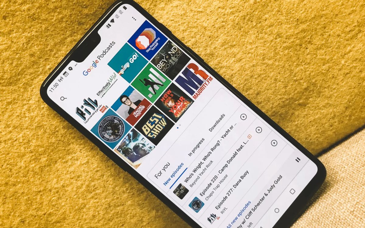
- Mobile devices: Test your logo on mobile devices to ensure its visibility and legibility on smaller screens. Consider how it looks as an app icon or within podcast player interfaces to ensure that it stands out among other podcasts.
Throughout these tests, take note of any issues or areas of improvement that you may come across. Consider seeking feedback from others, especially those within your target audience, to gather different perspectives on how your logo resonates with them. Incorporate any valuable feedback into the refinement process.
Remember that your logo should have a consistent visual presence across different platforms. It should be recognizable and effectively represent your podcast’s identity, regardless of where it appears. Once you have tested your logo and made necessary adjustments, it’s time to save and export your logo for actual use.
Step 8: Save and export your logo
After finalizing your logo design, it’s important to save and export it in the appropriate formats for various use cases. Here are the key steps to save and export your podcast logo:
- Save the master file: Save your logo design as a master file in a format that allows for easy editing and scalability, such as an Adobe Illustrator or SVG (Scalable Vector Graphics) file. This will serve as the source file for future modifications or resizing.
- Export in raster formats: Export your logo in raster formats suitable for online use, such as PNG or JPEG. Ensure that the resolution is high enough to maintain clarity and sharpness. Consider creating different sizes to accommodate different platforms and scenarios.
- Create vector-based formats: Export your logo in vector-based formats like EPS or PDF. These formats are ideal for print materials as they ensure scalability and maintain crispness and clarity, regardless of the size.
- Create favicon and social media icons: Create a favicon for your website by resizing and simplifying your logo. Additionally, generate appropriate sizes of your logo for social media profile pictures or icons. Follow platform-specific guidelines for optimal results.
- Organize files and folders: Create a well-structured folder system to keep your logo files organized. Label each file clearly and include different versions and formats for easy access in the future.
It’s important to save and store your logo files in multiple locations, such as cloud storage or external hard drives, to ensure their safety and accessibility. This way, you always have a backup in case of any file loss or corruption.
Remember to periodically review and update your logo as your podcast evolves or undergoes rebranding. Updating your logo ensures that it remains aligned with your evolving brand identity and maintains a fresh and relevant look.
By saving and exporting your logo in various formats and following best practices for organization, you’ll have a complete set of logo assets ready for use across different platforms and mediums.
Conclusion
Congratulations! You have successfully gone through the process of creating a captivating podcast logo. Your logo now represents the visual identity of your podcast, creating recognition, establishing credibility, and connecting with your target audience.
Throughout the steps outlined in this article, you have defined your podcast’s brand identity, gathered inspiration, decided on a logo style, chosen appropriate colors and fonts, sketched your ideas, designed and refined your logo, tested it across various platforms, and saved and exported it in different formats.
Remember that your podcast logo is not static. It should evolve alongside your podcast’s growth and changes. As your podcast develops a larger following or explores new content areas, you may need to revisit your logo design to ensure it remains relevant and aligned with your brand identity. Additionally, consider periodically assessing your logo’s effectiveness and seeking feedback from your audience to ensure it resonates with them.
Now that you have a beautifully designed podcast logo, proudly display it across all relevant platforms, from podcast cover art to social media profiles and promotional materials. Let your logo be the visual ambassador that attracts listeners and establishes a lasting impression of your podcast.
By following these steps and infusing your own creativity and unique style, your podcast logo will stand out in the podcasting landscape and contribute to the overall success of your podcast. Happy podcasting!


